Express Login

Your Rent Manager database contains valuable data that shows you how your business is performing, and what performance-improving opportunities are available. However, it can be difficult to dissect this information and clearly and quickly communicate it to other managers and owners. Running standard reports or exporting your data into Excel files are great ways to analyze your information, but those formats can be challenging for non-data-minded people to interpret. Help everyone on your team quickly understand your key metrics with data visualization.
Using data visualization, you can answer specific business questions and develop figure-driven ways to grow your operation.
Questions Data Visualization Can Help You Answer
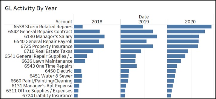
What are the biggest expense line items?
Everyone wants to keep tabs on their expenses, and visually displaying your General Ledger report is a great way to do so. For each expense General Ledger account you have, you can quickly view the total account activity represented in each horizontal bar. Easily identify big expense items, spot increases, and isolate decreases over time.
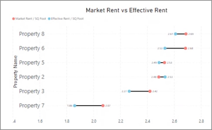
Are rents above or below market?
No one wants to leave money on the table by renting below market. By plotting your effective and market rent on a simple chart, you can see the properties that are renting above or below market rent. For each property, the blue dot shows the effective rent per square foot, and the red dot shows the market rent per square foot. The distance between the dots shows the magnitude of difference. When the blue dot is to the left of the red dot, the effective rent is below market.
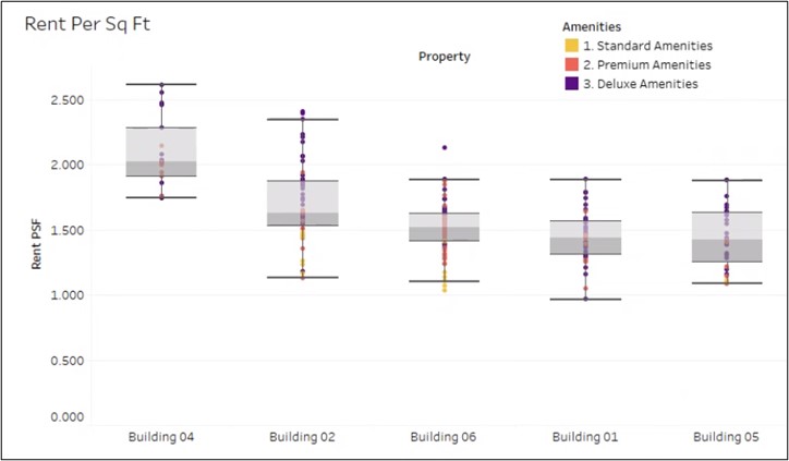
Is the rent for Deluxe amenity apartments more than the rent for Standard?
Not all units are the same. Some have more amenities and should therefore rent for more than others. By examining the rent roll, you can make sure that rents are set optimally. In this box plot, you can view the spread of Rent Per Sq Foot for 2BR/2BA units across several buildings in a portfolio.
Each dot represents an apartment. This operator categorizes their apartment amenities as Standard, Premium, and Deluxe. The color of the dot shows the amenities of the apartment. As this rent roll shows, some of the Deluxe apartments have a lower rent per square foot than the Standard apartments in each building.
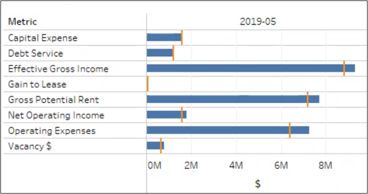
What is the variance in budget vs actual?
When it comes to performance against budget, you want to know the biggest items in your P&L and their variance to budget. A bullet chart can help you plan your finances by showing your actual amount and budget. The length of the blue bar tells us the actual amount, while the orange “notch” displays the budget. This way you can visually identify the items that are below or above budget and by how much.
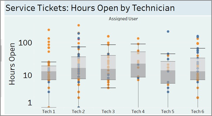
How long do service tickets remain open?
When the goal is to improve response times for closing tickets, it’s helpful to visualize the “spread” of ticket open times, from the shortest to the longest. A “box plot” represents each ticket as a dot, with the vertical position showing how many hours it has been open.
Below you see the tickets of each technician and the median open time. You can isolate cases that need attention by adding filters like “ticket type.”
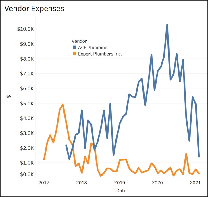
What are we paying our vendors?
It’s useful to know how much business you are conducting with your vendors, and if the amount has been increasing. A simple line chart can show your payments to two plumbing companies. Such graphs can be very interactive with the application of filters.
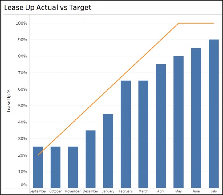
What is the progress toward Lease Up goals?
Lease Up is an important metric in student housing that can be viewed with a “combo” chart that uses bars and a line to show progress towards Lease Up goals. The line represents the target while the bar shows the actual Lease Up percent for each month.
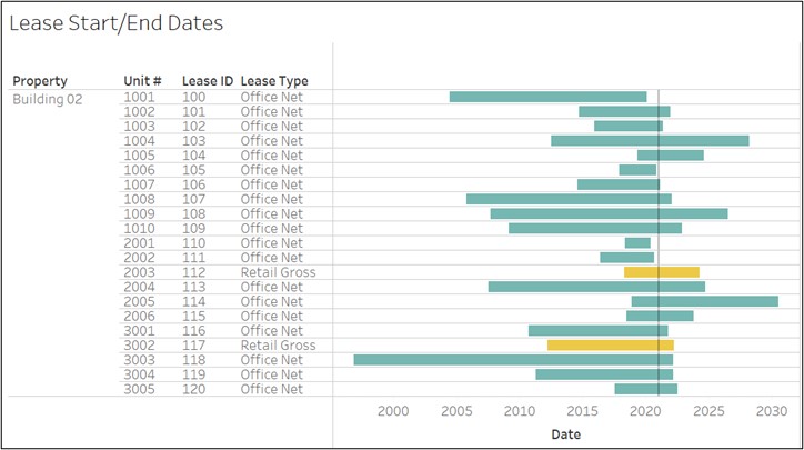
Which leases are ending soon?
To visually display leases that are about to end, you can utilize a Gantt chart. Each horizontal bar represents a lease, starting at the lease start date and extending through the lease end date. The vertical black reference line can be adjusted to your preferred time to show leases ending in its vicinity.
Spend less time managing Excel files and more time seeing, understanding, and utilizing your key metrics by utilizing data visualization. RentViewer’s integration with Rent Manager helps real estate executives monitor metrics and drive business performance using data analytics. RentViewer builds cloud data warehouses and business intelligence solutions using Power BI and Tableau.