Express Login
 Contact Us
 RMU Login
 Customer Portal
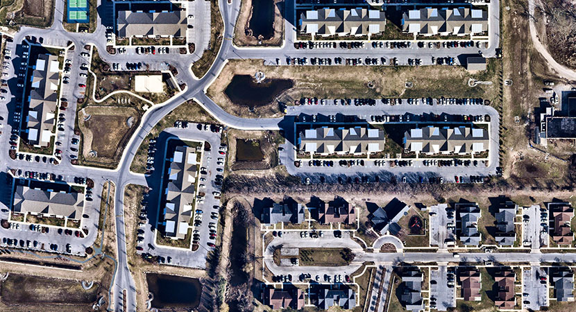
Historically, property management has relied heavily on lists, dropdown menus, and tables to display and organize information. While these formats work to a degree, a spreadsheet doesn’t show where a unit sits within a community and a table doesn’t show proximity to amenities, noise factors, or views. As portfolios grow and expectations rise, maps can make data easier to understand. By transforming unit-level data into a visual, spatial interface, maps reduce guesswork and provide better clarity for decision-making. This allows operators and renters to interact with information more intuitively.
Turning Data Into Real-World Context
Traditional property management tools ask users to do a lot of mental interpretation. For example, leasing teams must switch between systems, cross-reference unit numbers, and attempt to visualize layouts based on static information. This can be inefficient, especially when time is limited and decisions need to be made quickly.
Maps change the process entirely. Each unit is associated with a physical location within a property. This reduces friction in everyday workflows and allows users to grasp context at a glance. With a map-based interface, spotting availability patterns no longer means scanning a list line by line. It becomes immediately clear which units are clustered together, which are near high-demand amenities, and which may require additional attention. The result is a clearer picture of the property at a glance.
Elevating the Renter Experience
This same principle applies to a renter’s journey. Today’s prospects expect more than generic listings and stock floor plans when searching for an apartment online. They want to see how a space fits into their daily life before scheduling a tour. An interactive, unit-level view of a community lets them explore on their own terms.
Map-based searches let renters explore unit locations, compare pricing, and review real-time availability—all in one place. Details such as whether a unit is near parking, in a quieter corner, or close to specific amenities easily surface through this kind of visual interface. Information like this helps prospective renters make more informed decisions before visiting a property.
Maps as the Interface, Not the Add-On
Maps have long been treated as a secondary feature—a tool layered on top of existing systems rather than a key component of them. Teams might reference a map occasionally, but they still rely on dashboards and reports as their primary data source. That’s changing as map-based search becomes an increasingly important part of unit-level discovery on property websites, making it a necessity rather than a bonus.
When a map is the interface, users work from a single view where all information is organized spatially, instead of navigating multiple tools. Leasing activity, service requests, asset performance, and resident behavior can all be visualized within the same framework.
Driving Better Decisions Across Teams
The benefits of map-based interfaces extend beyond leasing and marketing. When information is unified spatially, teams can identify trends faster, allocate resources more effectively, and respond to challenges more proactively. Connecting data to a physical location surfaces insights that traditional tools miss.
This is particularly valuable in large or complex communities where layout and location significantly affect performance. Maps make it possible to spot opportunities that might otherwise remain hidden, whether that’s optimizing pricing strategies, improving maintenance workflows, or enhancing the resident experience.
A More Intuitive Future
As technology within the multifamily space continues to progress, the emphasis is on usability and clarity. Tools are no longer judged solely by the amount of data they can process, but by how effectively they help users understand and act on that information.
By aligning information with the way people naturally perceive space, maps reduce complexity and increase efficiency. When a map-based experience pulls unit-level data directly from property management software—including photos, pricing, and touring information—renters gain access to accurate, real-time information that helps them make informed decisions.
Maps aren’t just enhancing the overall renter journey; they’re changing how property management teams and renters interact with unit-level data. Engrain’s SightMap draws unit pricing and availability data from property management software like Rent Manager and displays it on websites so that information remains accurate and current. When paired with aligned teams and structured data practices, technology becomes an enabler of the certainty renters expect and the transparency they demand.