RMX Login
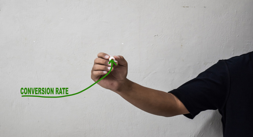
You’ve probably heard these web design basics: optimize for mobile, use high-quality visuals, and add clear calls to action (CTAs). But here’s the thing—everyone’s doing that. So, how do you stand out in a crowded market? The answer lies in behavioral psychology. By understanding how renters think and make decisions, you can design a website that not only attracts visitors but compels them to act. In this article, you’ll discover five advanced strategies rooted in psychology to optimize your property management website for conversions. These aren’t your run-of-the-mill tips—they’re proven techniques to turn your site into a lead-generating powerhouse.
Ready to unlock the secrets of website conversions? Let’s dive in.
1. Leverage the Power of Social Proof
Here’s something many property managers overlook: Renters are more likely to trust their peers than your marketing copy.
Why It Works: Social proof taps into the psychological principles of reciprocity (people want to do what others are doing) and FOMO (fear of missing out).
Actionable Tip: Your website should prominently showcase testimonials, reviews, and resident stories. For example, you could add a section titled “What Our Residents Are Saying” with testimonials and photos.
Pro Tip: Use real-time data to show how many people are currently viewing a property or have recently applied. Phrases like “3 people are viewing this property right now” create urgency.
Example: Imagine a renter lands on your website and sees a testimonial like this:
“I’ve lived here for two years, and the management team is amazing! They’re always responsive, and the community is so welcoming.”
Below it, they see: “5 people applied for this floor plan in the past 24 hours.”
Suddenly, that prospect isn’t just browsing—they’re applying.
2. Use Scarcity to Drive Action (Loss Aversion)
Did you know that people are more motivated by the fear of losing something than the possibility of gaining something?
Why It Works: Scarcity triggers loss aversion, a psychological principle that makes people act quickly to avoid missing out.
Actionable Tip: Highlight limited-time offers or low availability on your website. For example, “Only 2 units left at this price!” or “Special offer: Free move-in for applications submitted this week.”
Pro Tip: Use countdown timers for promotions to create a sense of urgency.
Example: A renter sees a banner on your homepage:
“Only 1 unit remaining! Schedule a tour today to lock in your spot.”
Below it, a countdown timer ticks away: “Offer ends in 2 hours, 14 minutes.”
The result? They’re more likely to click that “Schedule a Tour” button.
3. Design for Decision Fatigue (Simplify Choices)
Too many options can overwhelm renters and lead to decision paralysis.
Why It Works: The paradox of choice shows that when people are presented with too many options, they’re less likely to decide.
Actionable Tip: Limit the number of choices on your website. Instead of showing 20 floor plans, highlight your three most popular options with a link to “View All Plans.”
Pro Tip: Use filters and sorting options to help renters narrow down their choices. For example, “Filter by Price” or “Sort by Move-In Date.”
Example: A renter visits your website and sees:
“Our Most Popular Floor Plans: 1-Bedroom, 2-Bedroom, and Studio.”
Below it, a button says: “View All Floor Plans.”
By simplifying the initial choice, you guide visitors toward action without overwhelming them.
4. Use Color Psychology to Influence Behavior (Emotional Triggers)
Colors aren’t just decorative—they can influence how renters feel and act on your website.
Why It Works: Different colors evoke different emotions. For example, blue conveys trust, while green symbolizes growth and calm.
Actionable Tip: Use colors strategically in your CTAs and design. For example, a green “Schedule a Tour” button can feel more inviting than a red one. Test different color combinations to see what converts best.
Example: Your website’s primary CTA is a green button that says:
“Schedule a Tour Today!”
Green subconsciously communicates ease and positivity, making renters more likely to click.
5. Implement Micro-Interactions to Engage Users (Gamification)
Micro-interactions are small, interactive elements that make your website more engaging, and therefore more likely to see conversions.
Why It Works: These tiny interactions tap into the psychological principle of gamification, making the user experience more enjoyable and rewarding.
Actionable Tip: Add interactive elements like hover effects, progress bars, or clickable animations. For example, a progress bar that shows how many steps are left in the application process.
Pro Tip: Use micro-interactions to provide instant feedback. For example, a checkmark animation when a form is successfully submitted.
Example: A prospect starts filling out an application form. As they complete each section, a progress bar advances:
“Step 1 of 3: Contact Information (Completed!)”
“Step 2 of 3: Rental History (In Progress)”
This visual feedback keeps visitors engaged and motivated to finish the process.
Get Started
Like most property managers, you know how competitive the rental market is.
But with these five advanced strategies rooted in behavioral psychology, you can create a website that stands out and drives conversions.
Start by leveraging social proof and scarcity, then simplify choices, use color psychology, and implement micro-interactions.
Ready to take your property management website to the next level? Check out our Apartment Market Survey for more insights, or contact Brindle Digital Marketing for a free website audit.